


More notebooks for Think Stats

As I mentioned in the previous post, I am getting ready to teach Data Science in the spring, so I am going back through Think Stats and updating the Jupyter notebooks. I am done with Chapters 1 through 6 now.
If you are reading the book, you can get the notebooks by cloning this repository on GitHub, and running the notebooks on your computer. Or you can read (but not run) the notebooks on GitHub:
Chapter 4 Notebook (Chapter 4 Solutions)
Chapter 5 Notebook (Chapter 5 Solutions)
Chapter 6 Notebook (Chapter 6 Solutions)
I'll post the next batch soon; in the meantime, here are some of the examples from Chapter 5, including one of my favorites: How tall is the tallest person in Pareto World?
Exercise: In the BRFSS (see Section 5.4), the distribution of heights is roughly normal with parameters µ = 178 cm and σ = 7.7 cm for men, and µ = 163 cm and σ = 7.3 cm for women.
In order to join Blue Man Group, you have to be male between 5’10” and 6’1” (see http://bluemancasting.com). What percentage of the U.S. male population is in this range? Hint: use scipy.stats.norm.cdf.
scipy.stats contains objects that represent analytic distributions
In [27]:
import scipy.stats
For example scipy.stats.norm represents a normal distribution.
In [28]:
mu = 178
sigma = 7.7
dist = scipy.stats.norm(loc=mu, scale=sigma)
type(dist)
Out[28]:
scipy.stats._distn_infrastructure.rv_frozenA "frozen random variable" can compute its mean and standard deviation.
In [29]:
dist.mean(), dist.std()
Out[29]:
(178.0, 7.7000000000000002)It can also evaluate its CDF. How many people are more than one standard deviation below the mean? About 16%
In [30]:
dist.cdf(mu-sigma)
Out[30]:
0.15865525393145741How many people are between 5'10" and 6'1"?
In [31]:
# Solution

low = dist.cdf(177.8)    # 5'10"
high = dist.cdf(185.4)   # 6'1"
low, high, high-low
Out[31]:
(0.48963902786483265, 0.83173371081078573, 0.34209468294595308)Exercise: To get a feel for the Pareto distribution, let’s see how different the world would be if the distribution of human height were Pareto. With the parameters xm = 1 m and α = 1.7, we get a distribution with a reasonable minimum, 1 m, and median, 1.5 m.
Plot this distribution. What is the mean human height in Pareto world? What fraction of the population is shorter than the mean? If there are 7 billion people in Pareto world, how many do we expect to be taller than 1 km? How tall do we expect the tallest person to be?scipy.stats.pareto represents a pareto distribution. In Pareto world, the distribution of human heights has parameters alpha=1.7 and xmin=1 meter. So the shortest person is 100 cm and the median is 150.
In [32]:
alpha = 1.7
xmin = 1       # meter
dist = scipy.stats.pareto(b=alpha, scale=xmin)
dist.median()
Out[32]:
1.5034066538560549What is the mean height in Pareto world?
In [33]:
# Solution

dist.mean()
Out[33]:
2.4285714285714288What fraction of people are shorter than the mean?
In [34]:
# Solution

dist.cdf(dist.mean())
Out[34]:
0.77873969756528805Out of 7 billion people, how many do we expect to be taller than 1 km? You could use dist.cdf or dist.sf.
In [35]:
# Solution

(1 - dist.cdf(1000)) * 7e9, dist.sf(1000) * 7e9
Out[35]:
(55602.976430479954, 55602.976430479954)How tall do we expect the tallest person to be?
In [36]:
# Solution

# One way to solve this is to search for a height that we
# expect one person out of 7 billion to exceed.

# It comes in at roughly 600 kilometers.

dist.sf(600000) * 7e9
Out[36]:
1.0525452731613427In [37]:
# Solution

# Another way is to use `ppf`, which evaluates the "percent point function", which
# is the inverse CDF.  So we can compute the height in meters that corresponds to
# the probability (1 - 1/7e9).

dist.ppf(1 - 1/7e9)
Out[37]:
618349.61067595053Exercise: The Weibull distribution is a generalization of the exponential distribution that comes up in failure analysis (see http://wikipedia.org/wiki/Weibull_distribution). Its CDF is
$\mathrm{CDF}(x) = 1 − \exp[−(x / λ)^k]$
Can you find a transformation that makes a Weibull distribution look like a straight line? What do the slope and intercept of the line indicate?
Use random.weibullvariate to generate a sample from a Weibull distribution and use it to test your transformation.
Generate a sample from a Weibull distribution and plot it using a transform that makes a Weibull distribution look like a straight line.
thinkplot.Cdf provides a transform that makes the CDF of a Weibull distribution look like a straight line.
In [38]:
sample = [random.weibullvariate(2, 1) for _ in range(1000)]
cdf = thinkstats2.Cdf(sample)
thinkplot.Cdf(cdf, transform='weibull')
thinkplot.Config(xlabel='Weibull variate', ylabel='CCDF')

Exercise: For small values of n, we don’t expect an empirical distribution to fit an analytic distribution exactly. One way to evaluate the quality of fit is to generate a sample from an analytic distribution and see how well it matches the data.
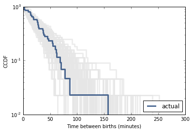
For example, in Section 5.1 we plotted the distribution of time between births and saw that it is approximately exponential. But the distribution is based on only 44 data points. To see whether the data might have come from an exponential distribution, generate 44 values from an exponential distribution with the same mean as the data, about 33 minutes between births.
Plot the distribution of the random values and compare it to the actual distribution. You can use random.expovariate to generate the values.
In [39]:
import analytic

df = analytic.ReadBabyBoom()
diffs = df.minutes.diff()
cdf = thinkstats2.Cdf(diffs, label='actual')

n = len(diffs)
lam = 44.0 / 24 / 60
sample = [random.expovariate(lam) for _ in range(n)]

1/lam, np.mean(sample)
Out[39]:
(32.72727272727273, 27.286365199609524)In [40]:
# Solution

model = thinkstats2.Cdf(sample, label='model')

thinkplot.PrePlot(2)
thinkplot.Cdfs([cdf, model], complement=True)
thinkplot.Config(xlabel='Time between births (minutes)',
                ylabel='CCDF',
                yscale='log')

In [41]:
# Solution

# If you plot distributions for a large number of samples, you get a sense
# of how much random variation to expect.  In this case, the data fall within
# the range we expect, so there is no compelling reason to think it is
# not exponential.

for i in range(100):
    sample = [random.expovariate(lam) for _ in range(n)]
    thinkplot.Cdf(thinkstats2.Cdf(sample), complement=True, color='0.9')

thinkplot.Cdf(cdf, complement=True)
thinkplot.Config(xlabel='Time between births (minutes)',
                ylabel='CCDF',
                yscale='log')
Worked Example: The distributions of wealth and income are sometimes modeled using lognormal and Pareto distributions. To see which is better, let’s look at some data.
The Current Population Survey (CPS) is a joint effort of the Bureau of Labor Statistics and the Census Bureau to study income and related variables. Data collected in 2013 is available from http://www.census.gov/hhes/www/cpstables/032013/hhinc/toc.htm. I downloaded hinc06.xls, which is an Excel spreadsheet with information about household income, and converted it to hinc06.csv, a CSV file you will find in the repository for this book. You will also find hinc.py, which reads this file.
Extract the distribution of incomes from this dataset. Are any of the analytic distributions in this chapter a good model of the data?
In [42]:
import hinc
df = hinc.ReadData()
df
Out[42]:
income freq cumsum ps 0 4.999000e+03 4204 4204 0.034330 1 9.999000e+03 4729 8933 0.072947 2 1.499900e+04 6982 15915 0.129963 3 1.999900e+04 7157 23072 0.188407 4 2.499900e+04 7131 30203 0.246640 5 2.999900e+04 6740 36943 0.301679 6 3.499900e+04 6354 43297 0.353566 7 3.999900e+04 5832 49129 0.401191 8 4.499900e+04 5547 54676 0.446488 9 4.999900e+04 5254 59930 0.489392 10 5.499900e+04 5102 65032 0.531056 11 5.999900e+04 4256 69288 0.565810 12 6.499900e+04 4356 73644 0.601382 13 6.999900e+04 3949 77593 0.633629 14 7.499900e+04 3756 81349 0.664301 15 7.999900e+04 3414 84763 0.692180 16 8.499900e+04 3326 88089 0.719341 17 8.999900e+04 2643 90732 0.740923 18 9.499900e+04 2678 93410 0.762792 19 9.999900e+04 2223 95633 0.780945 20 1.049990e+05 2606 98239 0.802226 21 1.099990e+05 1838 100077 0.817235 22 1.149990e+05 1986 102063 0.833453 23 1.199990e+05 1464 103527 0.845408 24 1.249990e+05 1596 105123 0.858441 25 1.299990e+05 1327 106450 0.869278 26 1.349990e+05 1253 107703 0.879510 27 1.399990e+05 1140 108843 0.888819 28 1.449990e+05 1119 109962 0.897957 29 1.499990e+05 920 110882 0.905470 30 1.549990e+05 1143 112025 0.914803 31 1.599990e+05 805 112830 0.921377 32 1.649990e+05 731 113561 0.927347 33 1.699990e+05 575 114136 0.932042 34 1.749990e+05 616 114752 0.937072 35 1.799990e+05 570 115322 0.941727 36 1.849990e+05 502 115824 0.945826 37 1.899990e+05 364 116188 0.948799 38 1.949990e+05 432 116620 0.952327 39 1.999990e+05 378 116998 0.955413 40 2.499990e+05 2549 119547 0.976229 41 inf 2911 122458 1.000000
Here's what the CDF looks like on a linear scale.
In [43]:
xs, ps = df.income.values, df.ps.values
cdf = thinkstats2.Cdf(xs, ps, label='data')
cdf_log = thinkstats2.Cdf(np.log10(xs), ps, label='data')

# linear plot
thinkplot.Cdf(cdf)
thinkplot.Config(xlabel='household income',
                   ylabel='CDF')

To check whether a Pareto model describes the data well, I plot the CCDF on a log-log scale.
I found parameters for the Pareto model that match the tail of the distribution.
In [44]:
xs, ys = thinkstats2.RenderParetoCdf(xmin=55000, alpha=2.5,
                                     low=0, high=250000)

thinkplot.Plot(xs, 1-ys, label='model', color='0.8')

thinkplot.Cdf(cdf, complement=True)
thinkplot.Config(xlabel='log10 household income',
                 ylabel='CCDF',
                 xscale='log',
                 yscale='log',
                 loc='lower left')

For the lognormal model I estimate mu and sigma using percentile-based statistics (median and IQR).
In [45]:
median = cdf_log.Percentile(50)
iqr = cdf_log.Percentile(75) - cdf_log.Percentile(25)
std = iqr / 1.349

# choose std to match the upper tail
std = 0.35
print(median, std)
4.74035479316 0.35
Here's what the distribution, and fitted model, look like on a log-x scale.
In [46]:
xs, ps = thinkstats2.RenderNormalCdf(median, std, low=3.5, high=5.5)
thinkplot.Plot(xs, ps, label='model', color='0.8')

thinkplot.Cdf(cdf_log)
thinkplot.Config(xlabel='log10 household income',
                 ylabel='CDF')

My conclusions based on these figures are:
1) The Pareto model might be a reasonable choice for the top 10-20% of incomes.
2) The lognormal model captures the shape of the distribution better, with some deviation in the left tail. With different choices for sigma, you could match the upper or lower tail, but not both at the same time.
In summary I would say that neither model captures the whole distribution, so you might have to
1) look for another analytic model,
2) choose one that captures the part of the distribution that is most relevent, or
3) avoid using an analytic model altogether.
In [ ]:
<